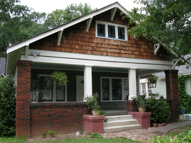
Patrick and I thought this day would never come the day we would no longer live in the PINK house! (Warning get ready for an image-heavy post!)
Although we immediately fell in love with the general charm of our house, the one thing we never liked was that it was a pink house. The salmon-colored body color with the dark pink accent just wasn’t our style. Unfortunately our dreams of a different color were crushed when we got a number of painting estimates two years ago. Fast forward to 2009 (i.e. a couple of years of saving $) and exterior paint that looked like this
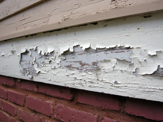
and we decided we were in dire need of revisiting the exterior painting subject. Like urgently.
So we called one of the painters from two years ago (who was our favorite based on the historic house painting experience) and said “if the cost is the same as 2 years ago we’ll go with you.” Before we knew it we were told “we’ll be there tomorrow morning.” Holy dog doo doo this was really about to happen!!
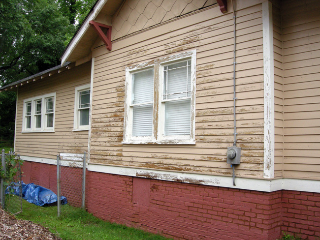
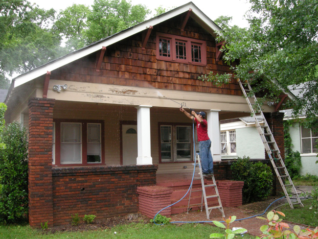
The first step in the process was to pressure wash the house. This was to get rid of any loose paint. Here is the south-facing wall of our house after it was pressure washed:
Pressure washing in action:
The next step was to scrape off any semi-loose paint that the pressure washer didn’t get off:
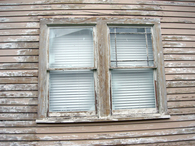
Close-up of a south facing window after the pressure washing, scraping, and sanding.
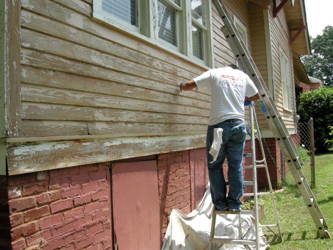
Choosing the color has been the hardest part of the process. I keep joking that it was harder to decide on an exterior color than it was to get married, haha. (Of course I have such a wonderful husband that it wasn’t a hard choice to want to spend the rest of my life with him!) But seriously, I have some serious color commitment issues. I mean, this is the color I’m (hopefully) going to be stuck with for the next 15 years! This is a big investment! We knew we wanted a more neutral color and decided to head in the grey direction. After a visit to the Sherwin Williams paint store and picking through their selection of greys we initially picked two trial colors: “Uncertain Grey” (how fitting) on the top left, and “Rare Grey” on the top right. We immediately decided the “Uncertain Grey” was way too blue and decided we liked the “Rare Grey” better. However, we were wondering if the color was too pale and thought we may as well invest a few extra bucks and try two other darker shades from the same color swatch: “Link Grey” on the bottom right, and “Cast Iron” on the bottom left. Finally the big decision was made ”Link Grey” (bottom right) was our decision.
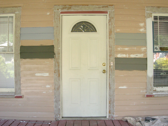
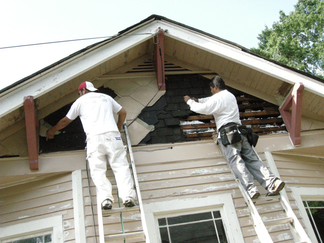
During the painting process we needed to address some house repair issues. The gables on both the north and south facing walls had old diamond shingles on the side. We’ve wanted to get rid of these, so this was obviously the right time. Come to find out there were two more layers of shingles underneath the diamond ones.
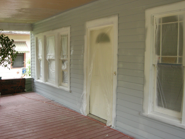
The next step was priming. For a day we thought we were quarantined in our own house with all that protective plastic over the windows and doors!
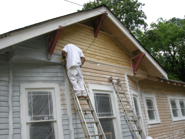
Here the north facing gable has the newly installed siding (from good ol’ Randall Brothers). I think this photo is really interesting because it shows the various stages old scraped color, newly primed siding, and newly placed wood siding.
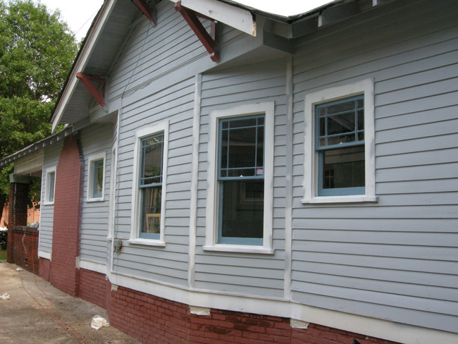
The north facing side of the house with primed body and primed window sashes:
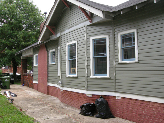
The north facing side of the house with final body color:
On the back of the house we had an area that we’ve also been wanting to fix for a while because the insulation has been hanging out.
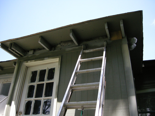
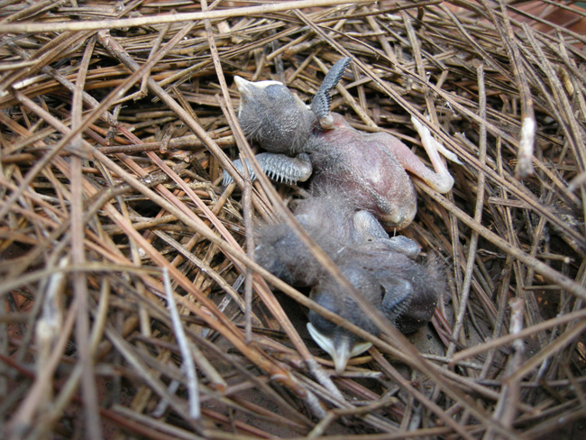
The only problem was that a mama bird had set up a home in our insulation that we were about to board up! I like to tell myself that the three little baby birds we had to take out of our house were moved by the mama bird over night because they were gone the next morning. (Shhhh, I don’t want to hear your opinions of what else may have happened with them I’m sticking to my story!)
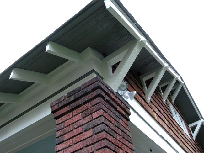
Here is a beautiful detail shot of the brackets on the front of the house. Previously the dark pink brackets blended in with the cedar shingles. Now the white brackets against the “Link Grey” colored roof decking by the cedar shingles has a nice, bold contrast.
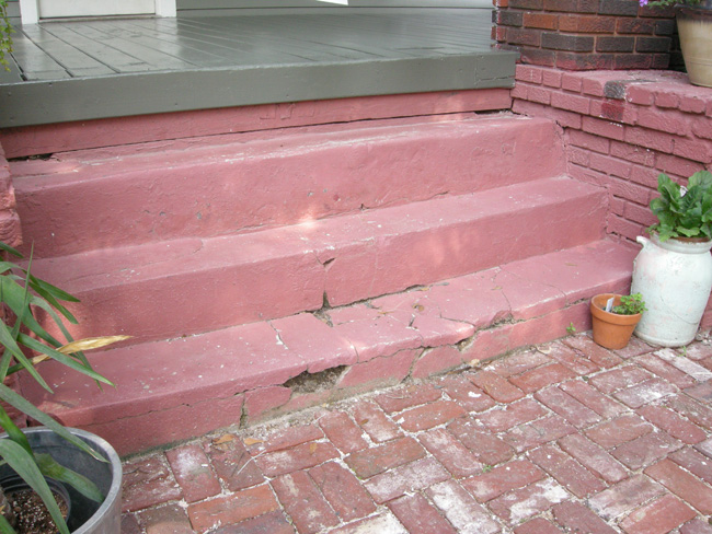
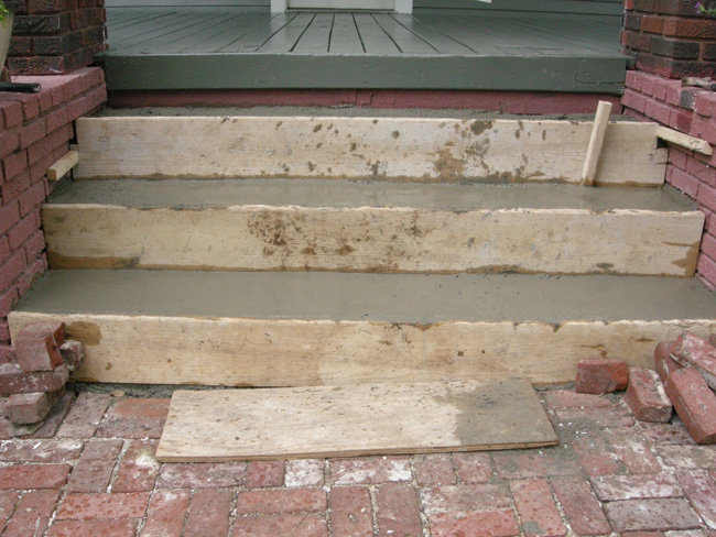
While we were on a roll we thought “why stop here?” We are already working on our new entry door may as well replace those dangerous entry steps!
The whole stair process was entirely rushed and unsatisfactory (unlike the painting process), but perhaps I will come back and go into more detail about that another day. In any case, here the steps were being poured:
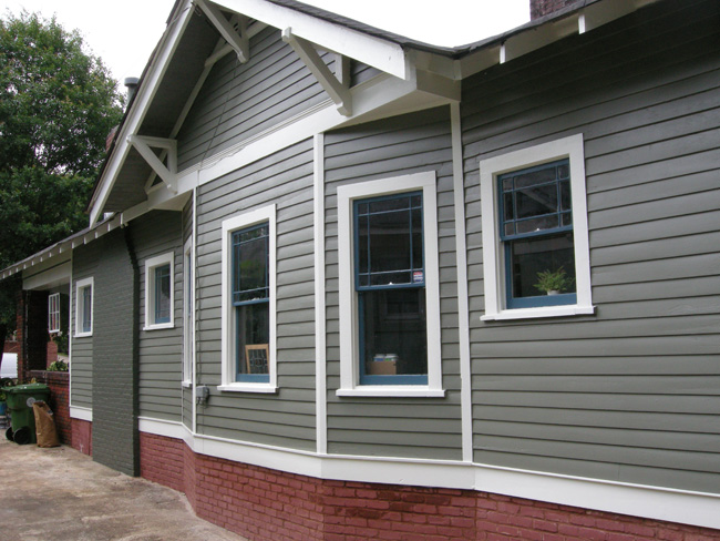
Two and a half weeks later we have the final product “Link Grey” is the main body color, “Classic Light Bluff” is the trim accent color, “Bunglehouse Blue” is the window sash color, and “Cast Iron” is the chimney color. As pointed out on a previous photo, we had the underside of the roof painted the main house color to create a greater contract against the white accent color.
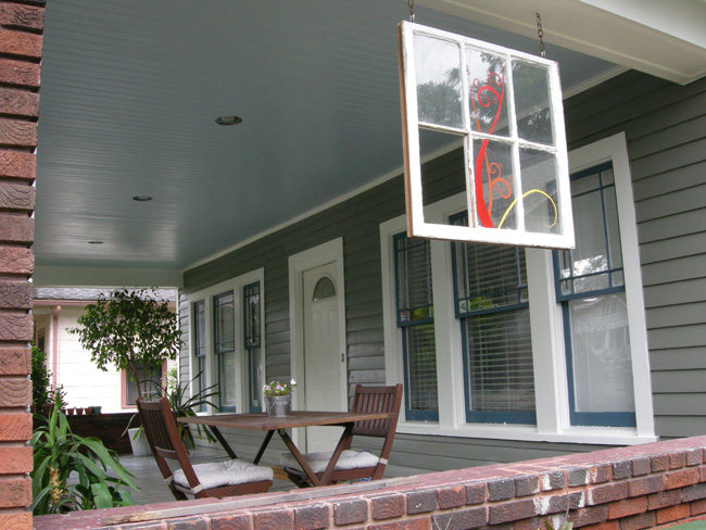
In this “after” porch photo you can see we actually used a fifth color for the porch ceiling based on what we know was often historically used. The ceiling is called “Atmosphere”. We were advised by the lady at Sherwin Williams that this is the color most commonly bought for porch ceiling purposes, so that is how we decided on it.
The front of the house in its final form (…well, at least for now…). New neutral grey color with nice contrast to the cedar shingles and dark red brick. And new stairs that you don’t have to stumble down anymore. We love it!!!
